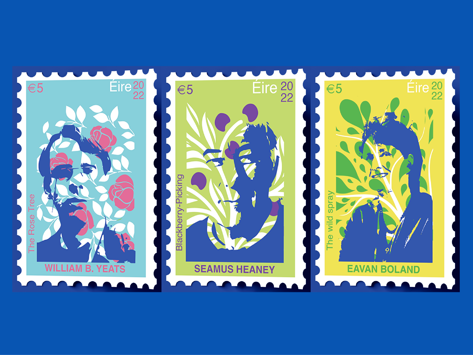

ABOUT the company
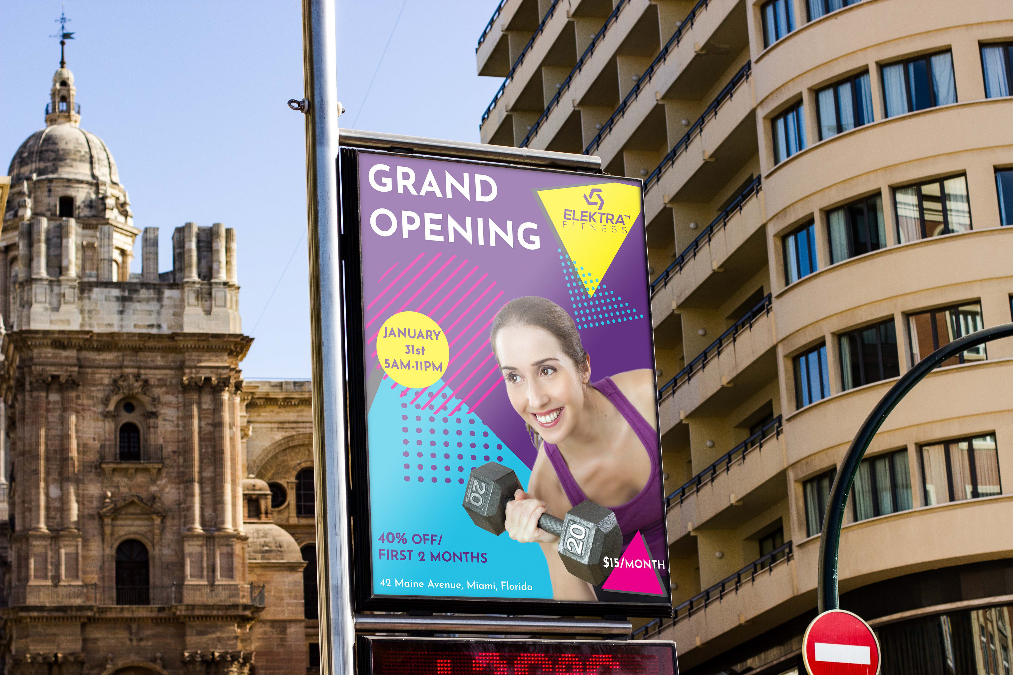
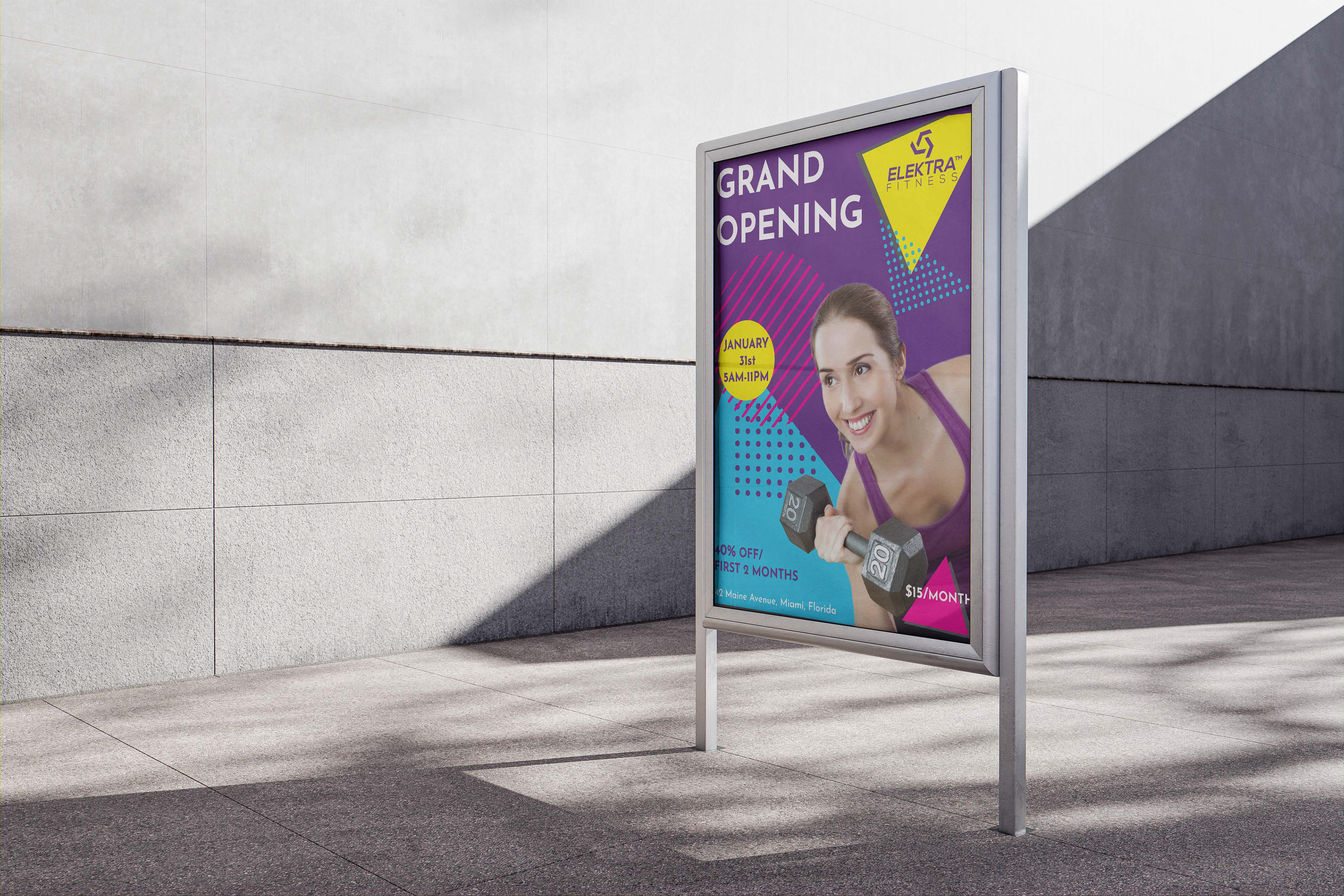
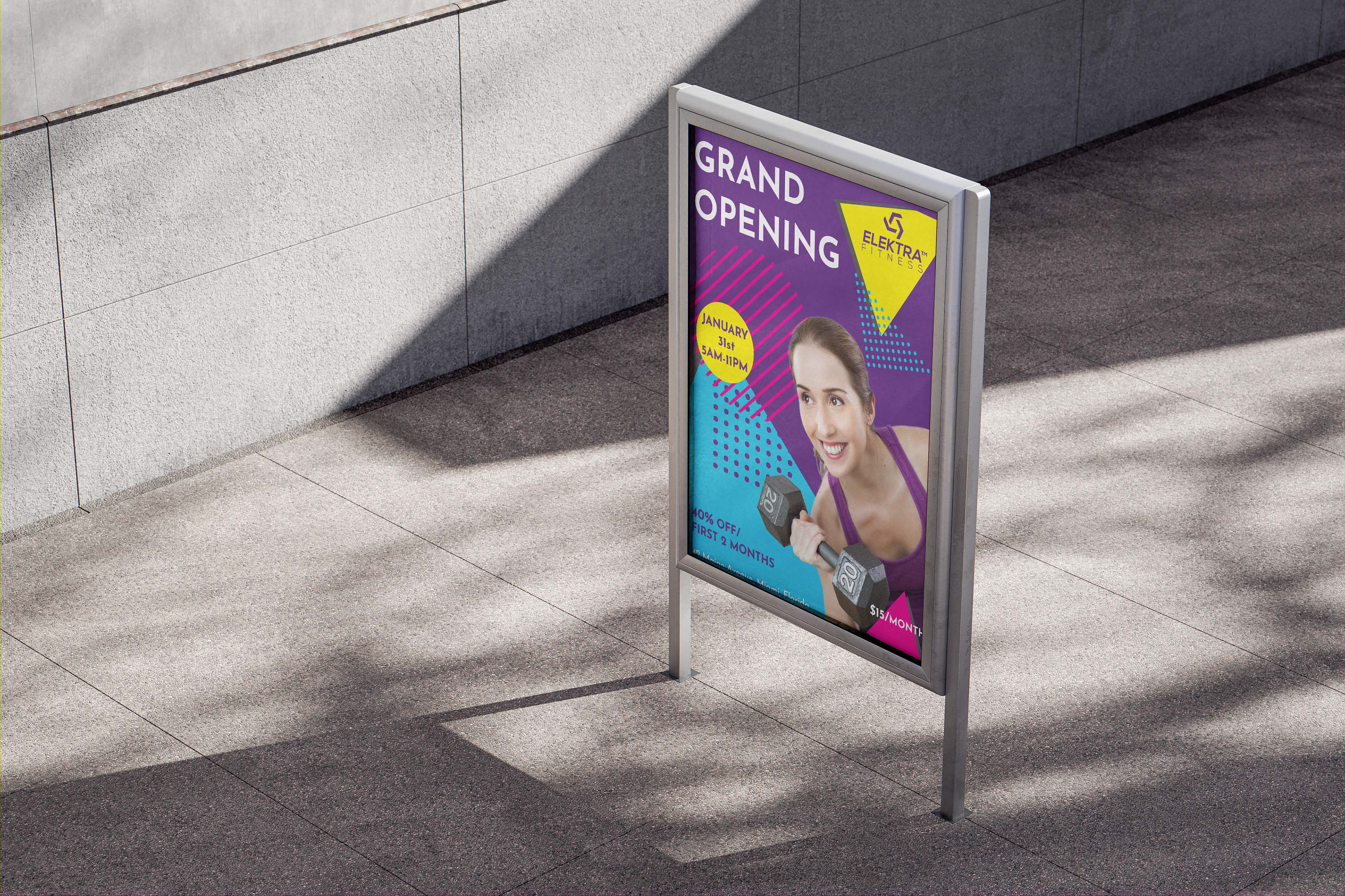
ELEKTRA™ is a gym company that aims to add some fun to exercise. People are often intimidated by fitness, and tend to see gyms as daunting or scary. Elektra therefore sought to use engaging colors in an effort to help positively influence people’s mindset about fitness as a whole and to motivate people to give their gym a try. Although Elektra is a modern gym company, it felt that the 80s-aerobics-era take on fitness using vibrant and lively colors and geometric shapes would be an appealing way to present fitness and make it more approachable.

THE BRIEF was to design a poster announcing the grand opening of Elektra’s first location using an 80s aerobics-era aesthetic, while keeping it modern and practical. I used vibrant and lively colours and geometric shapes mirroring the Elektra logo and aimed at showcasing that Elektra is a fun company. For typeface, I used Josephin Sans, a geometric sans serif font.
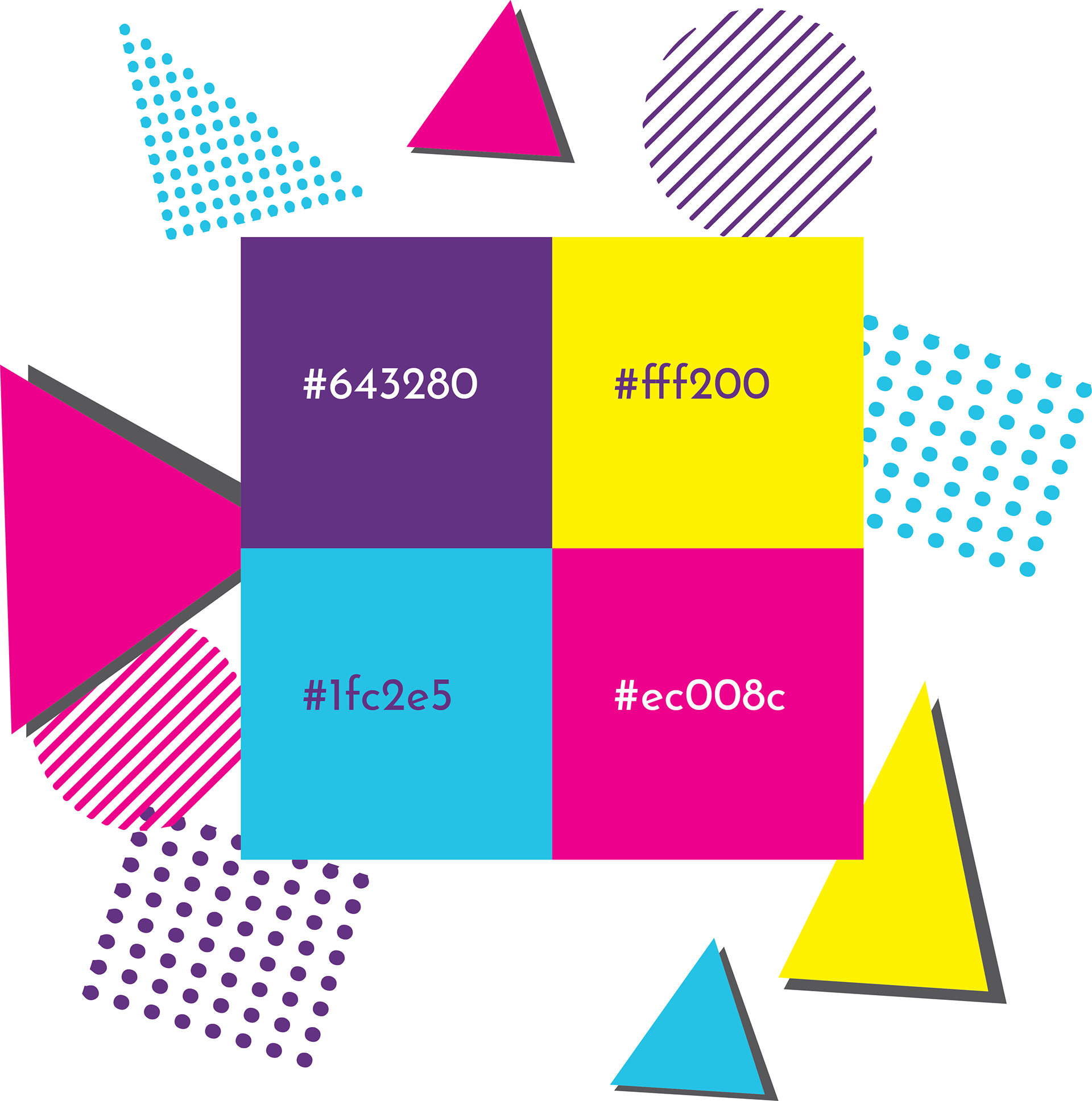
I chose vibrant colors to remind us of 80’s aesthetics as well as the shapes
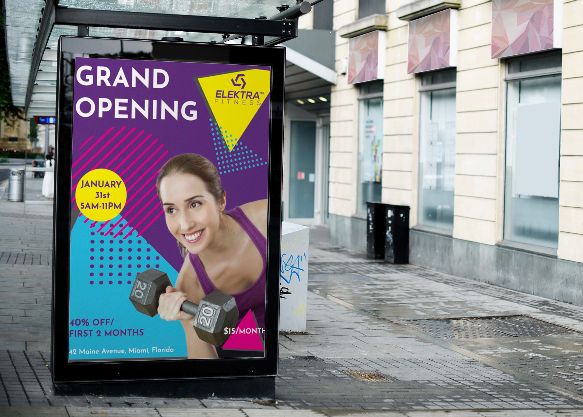
The poster needs to be appealing to as broad a demographic as possible, especially those who are attracted by bright, fun, and vibrant design.