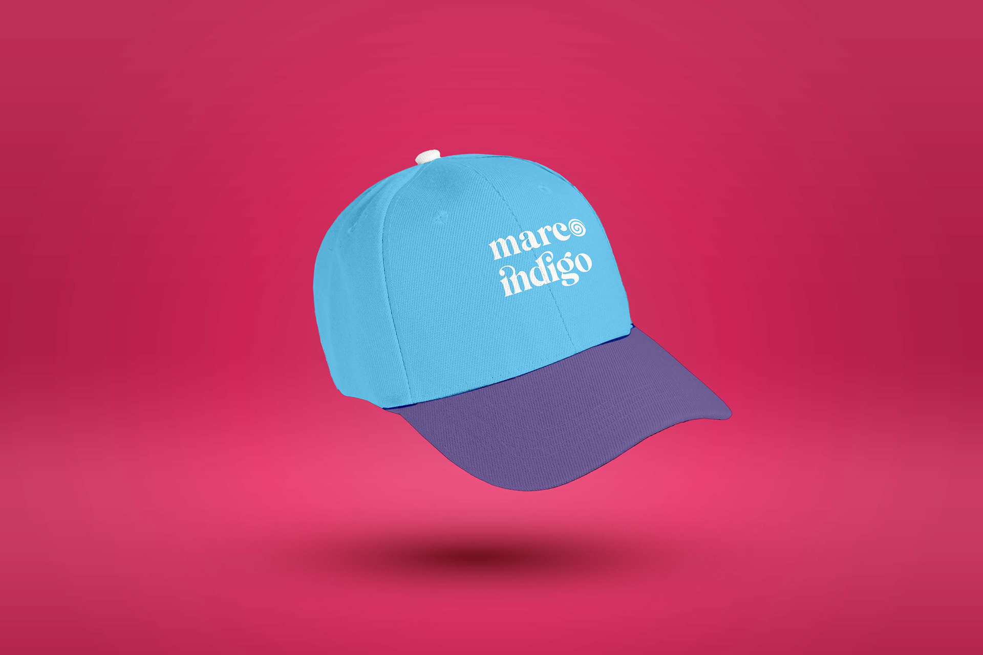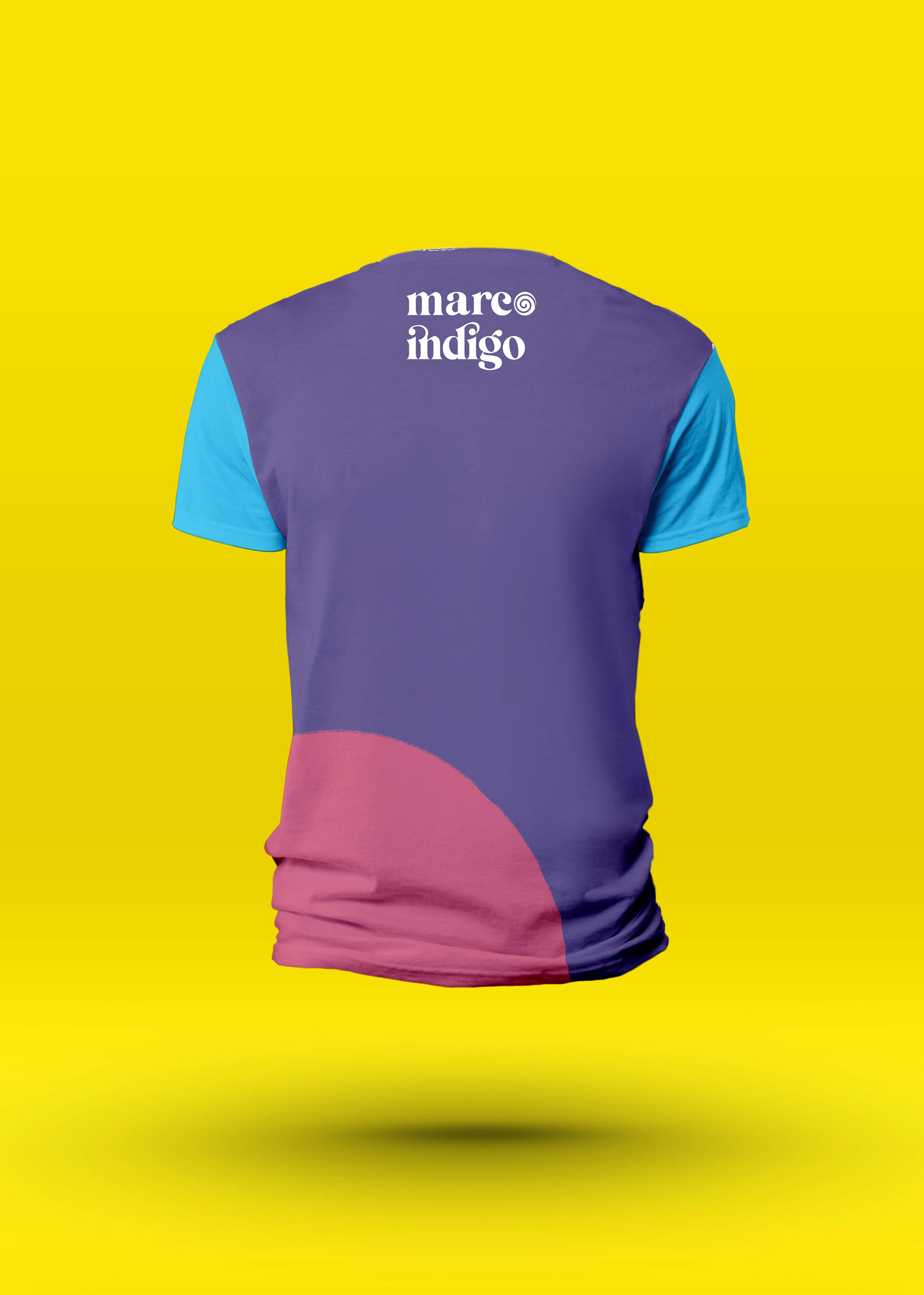
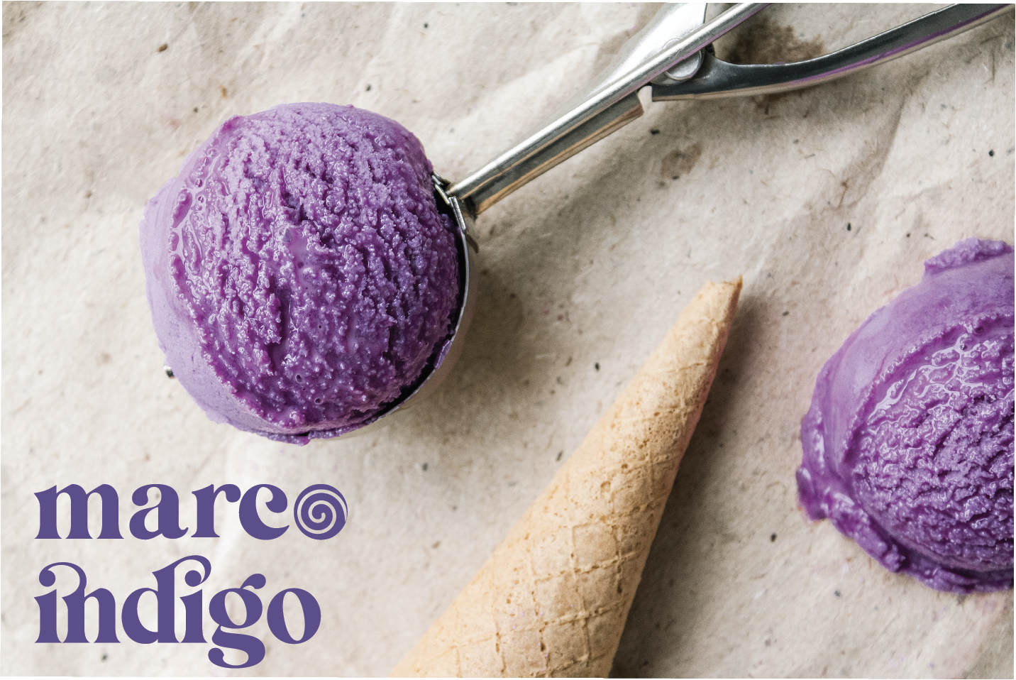
MARCO INDIGO sells ice-cream in large and small cones. They try to keep a fun, inviting, and playful tone but make it a little more grown up. They want their ice cream to surprise people and to show ice cream is for everyone, not just kids. Their target market is young adults, especially social media influencers.
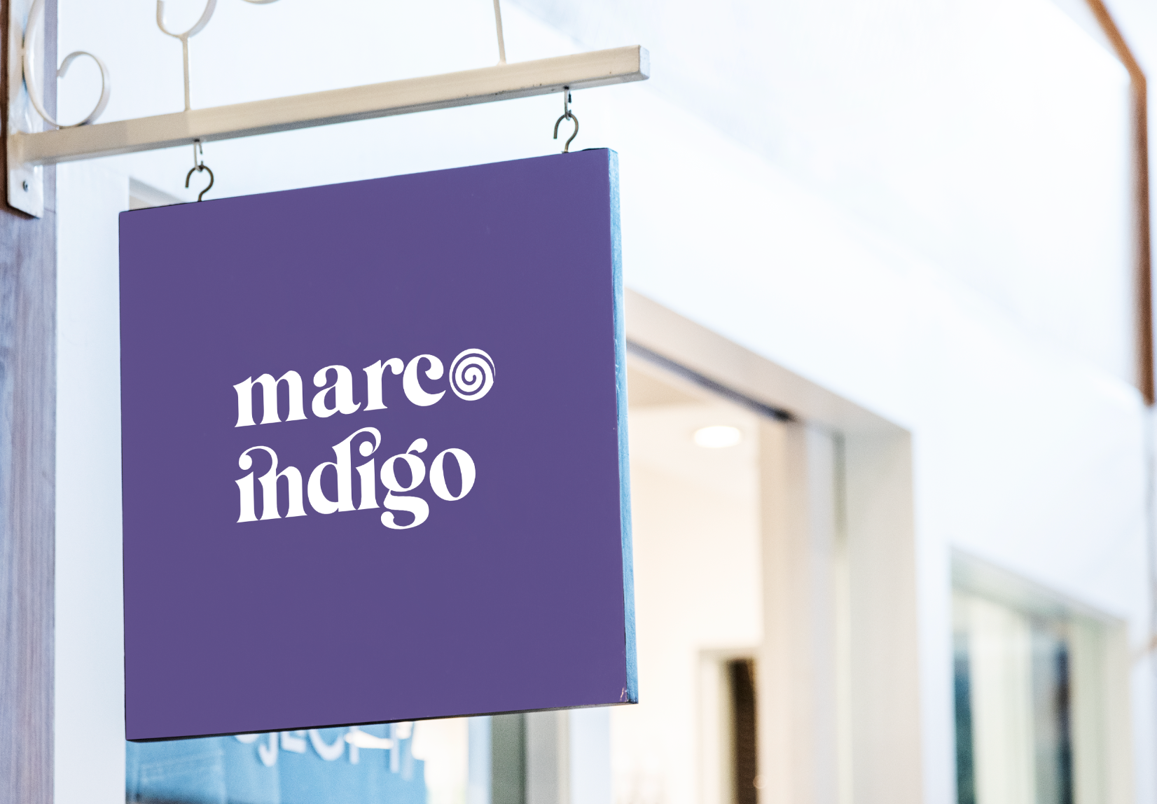
logo
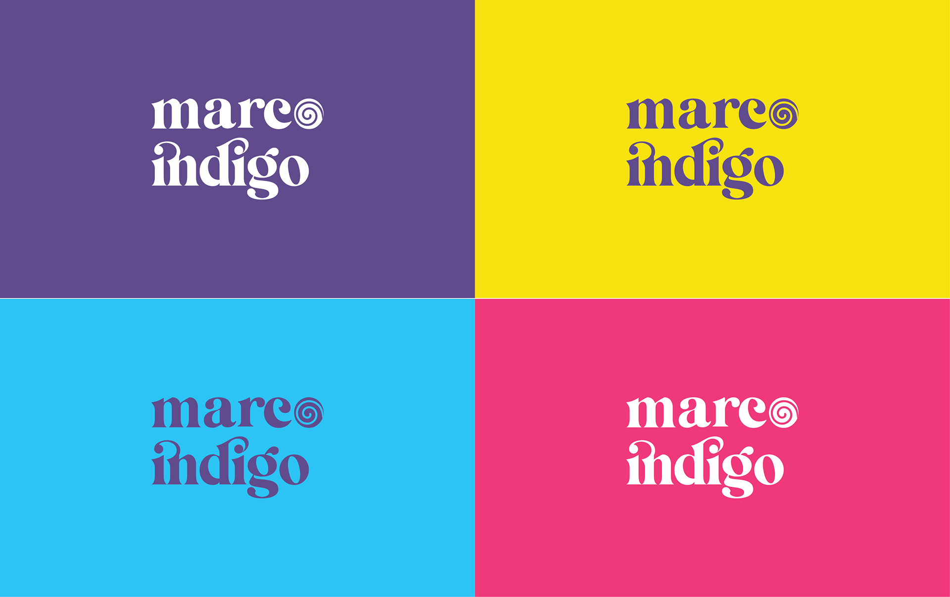
MARCO INDIGO wants to position itself as unique compared with other ice cream shops, which often use pastel colours and target children as their primary audience. Nevertheless, Marco Indigo wants their branding to be playful and inviting, and to keep a sense of fun, albeit with a more grown-up looking design. This is why I chose bright colours and engaging design for the brand.
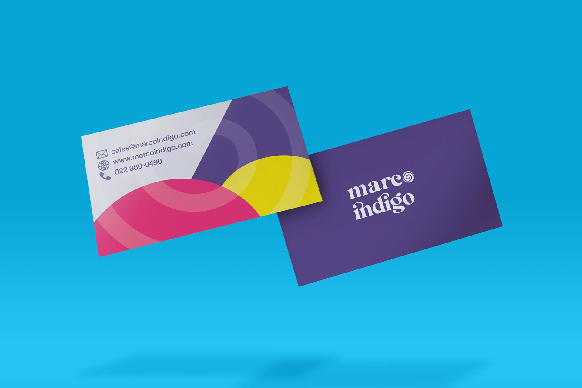
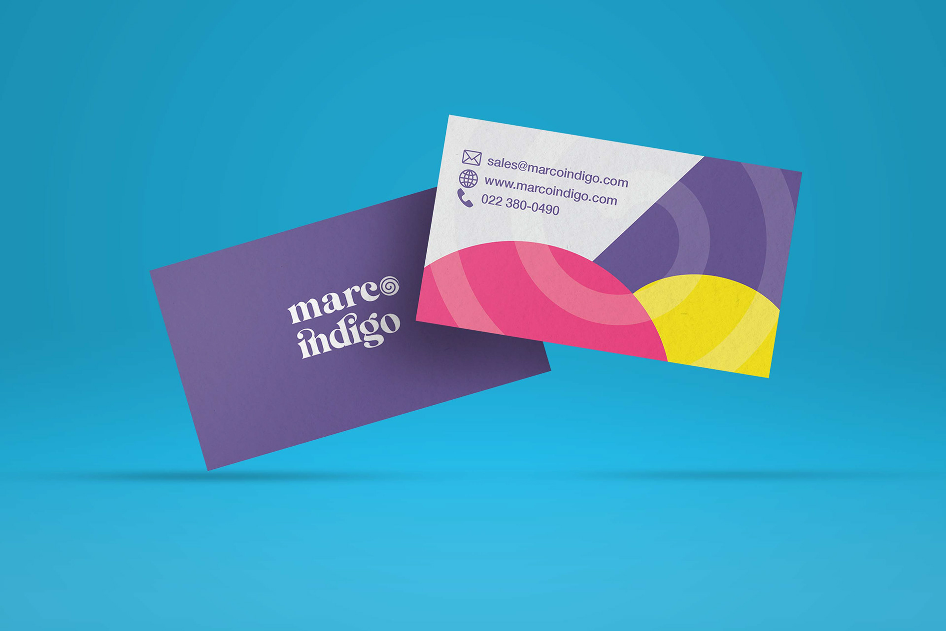
BUSINESS CARD
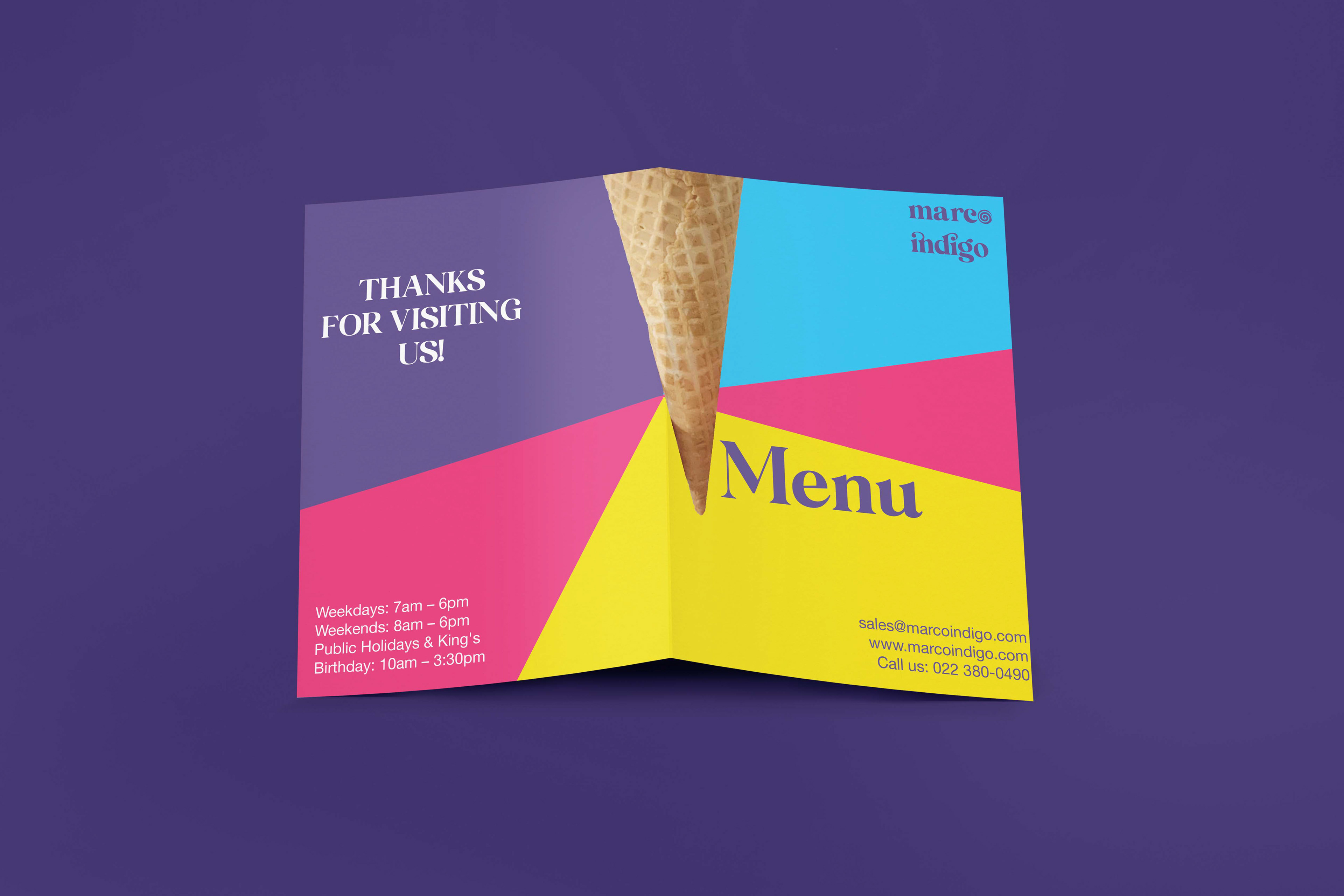
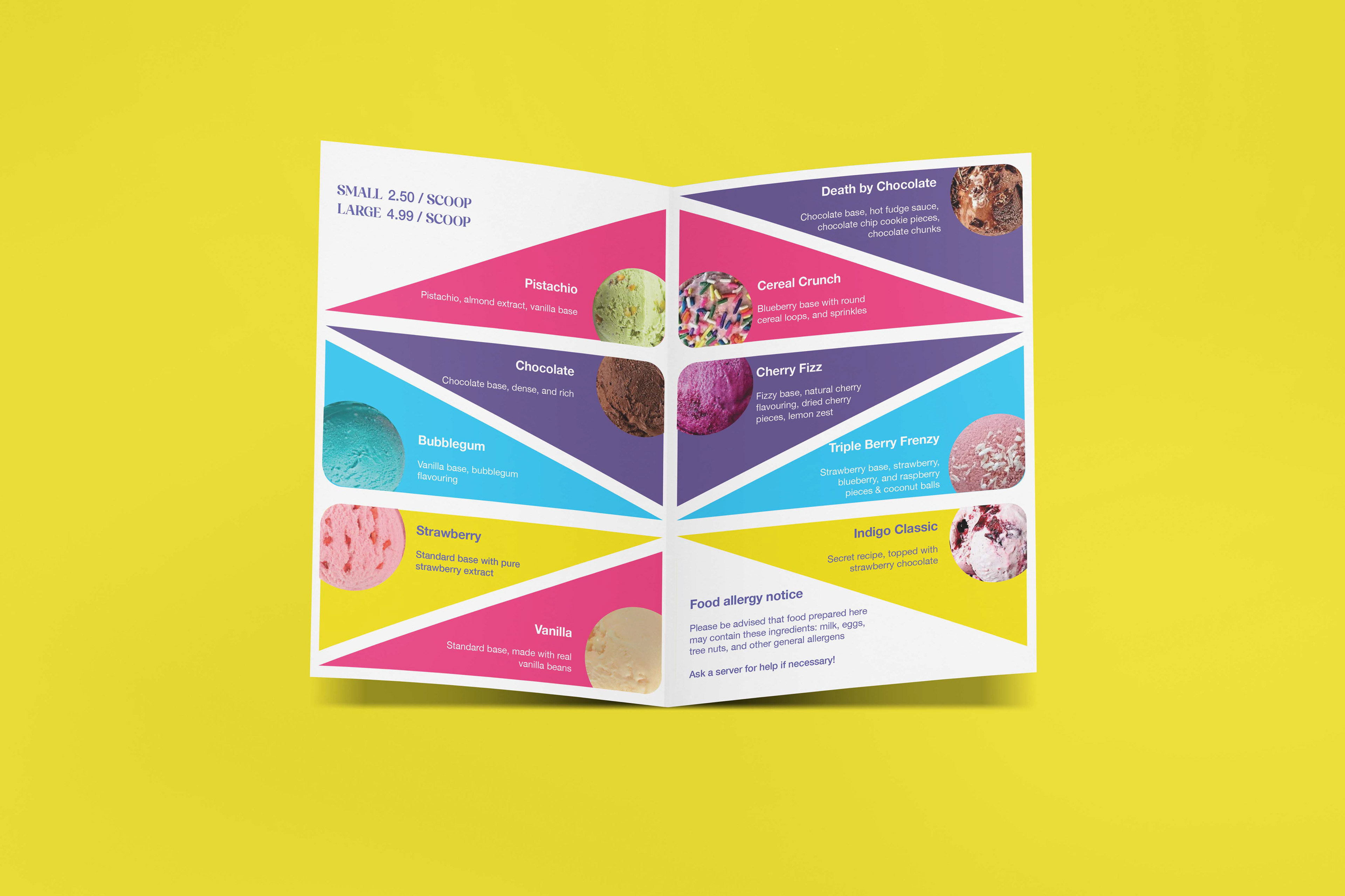
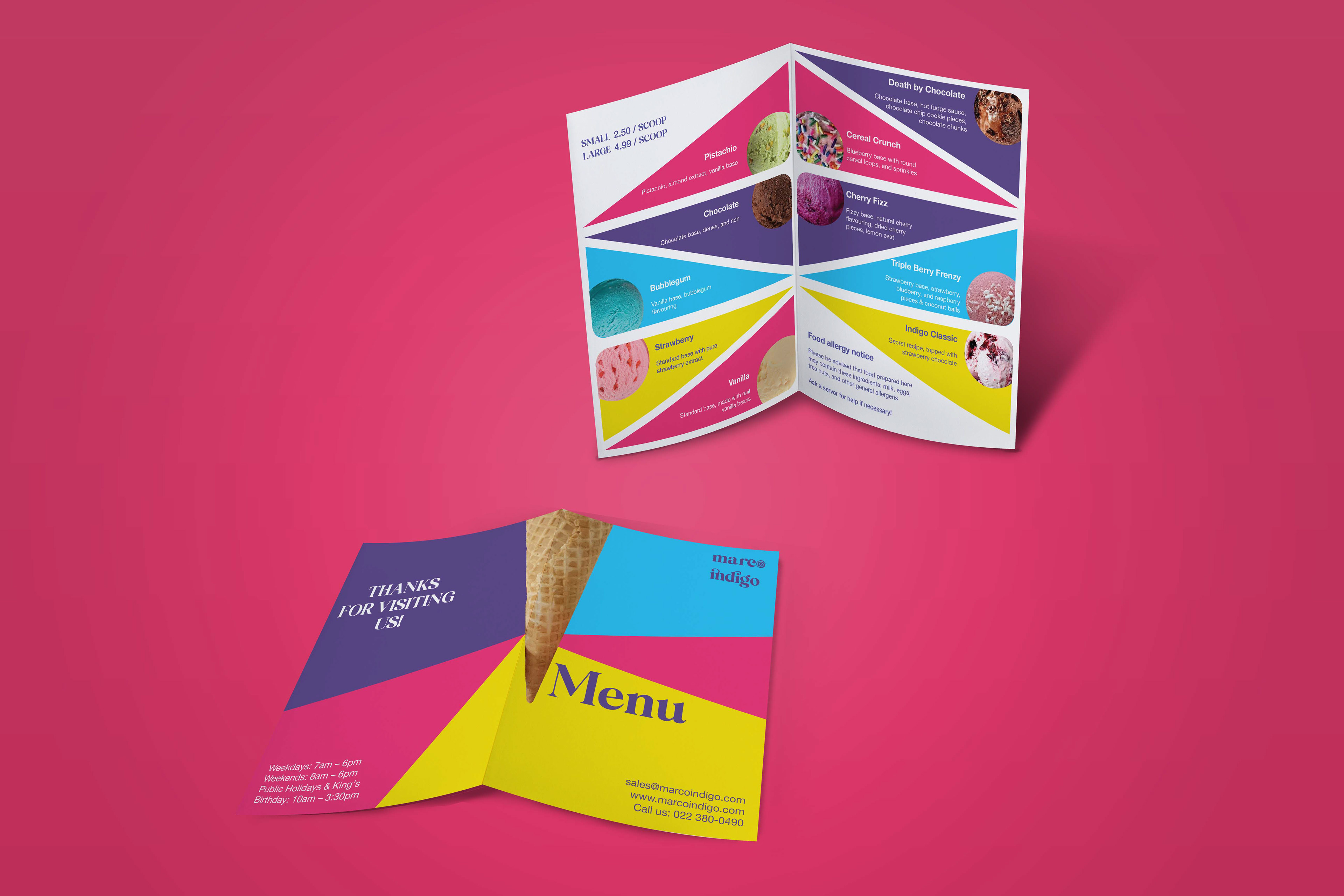
MENU
The brief asked to design a menu on a bi-fold A3, with inside and outside designs. The company sells 10 flavours. I designed a menu using fun, bright colours. For the shapes, I used triangles to reflect an ice cream cone and to separate different ice cream flavours to bring a sense of cleanness and to make it easy to read.
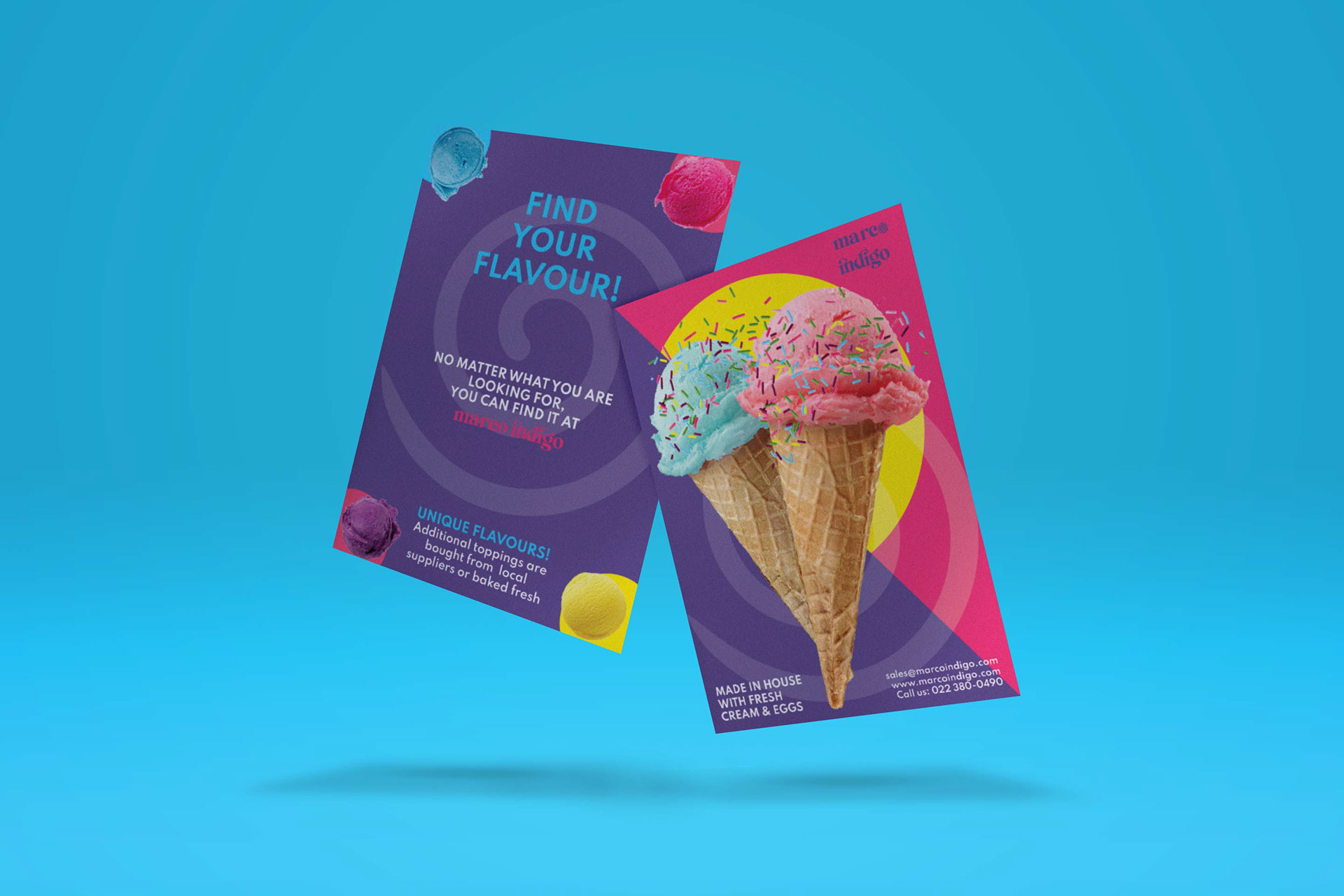
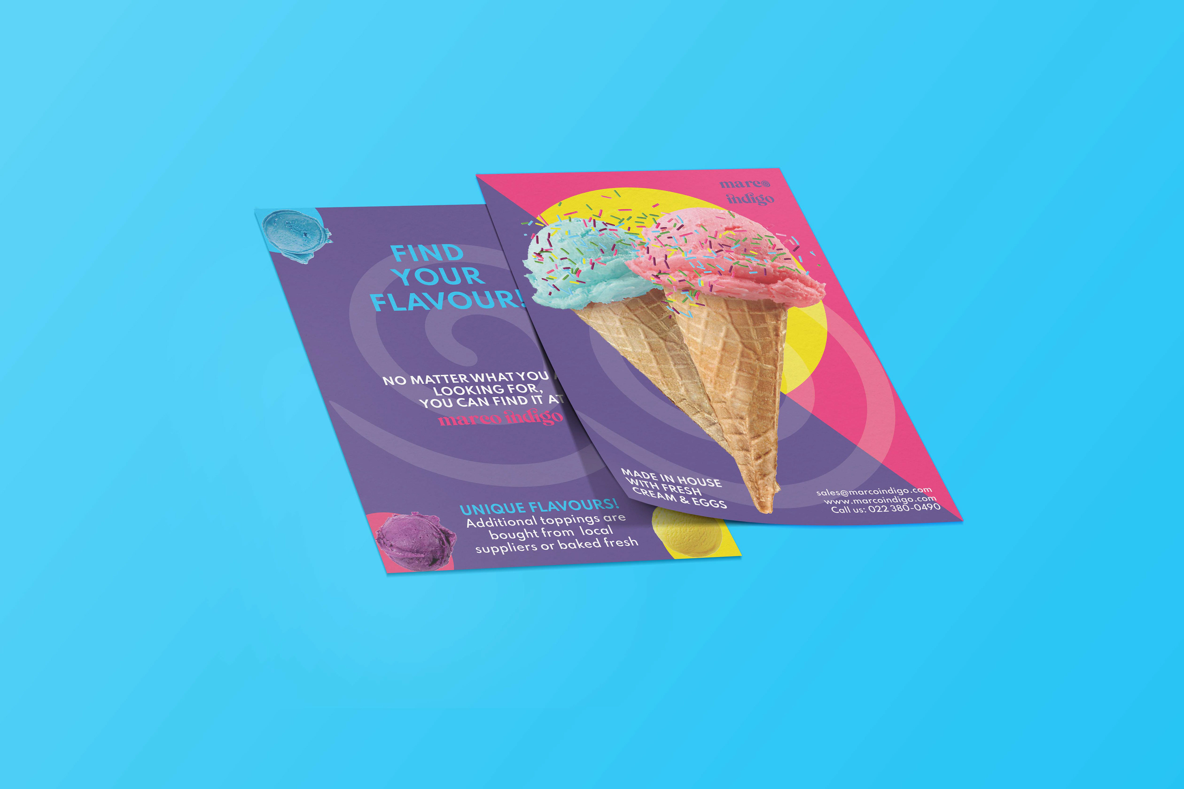
FLYER
MARCO INDIGO wants to create a sense of intrigue, where people want to come into the store, expecting to see something new, mysterious, and exciting.
Uniform – Unisex shirt and hat