
Penn State is a well-known pretzel brand. The goal for the redesign is to make the packaging stand out. I felt it looked bland, and wanted to give it a look that would catch the eye. The pretzels themselves were not well highlighted. I tried to give this brand a contemporary, modern look by using vibrant warm colours and showing the package contents with a see-through window on the front. I also wanted to give this brand more of a personality. I aimed to achieve this through the use of hierarchy and a better font, graphic illustrations, and images of pretzels. Vibrant colours help the product better stand out, together with the addition of some illustrations of knots to the design.
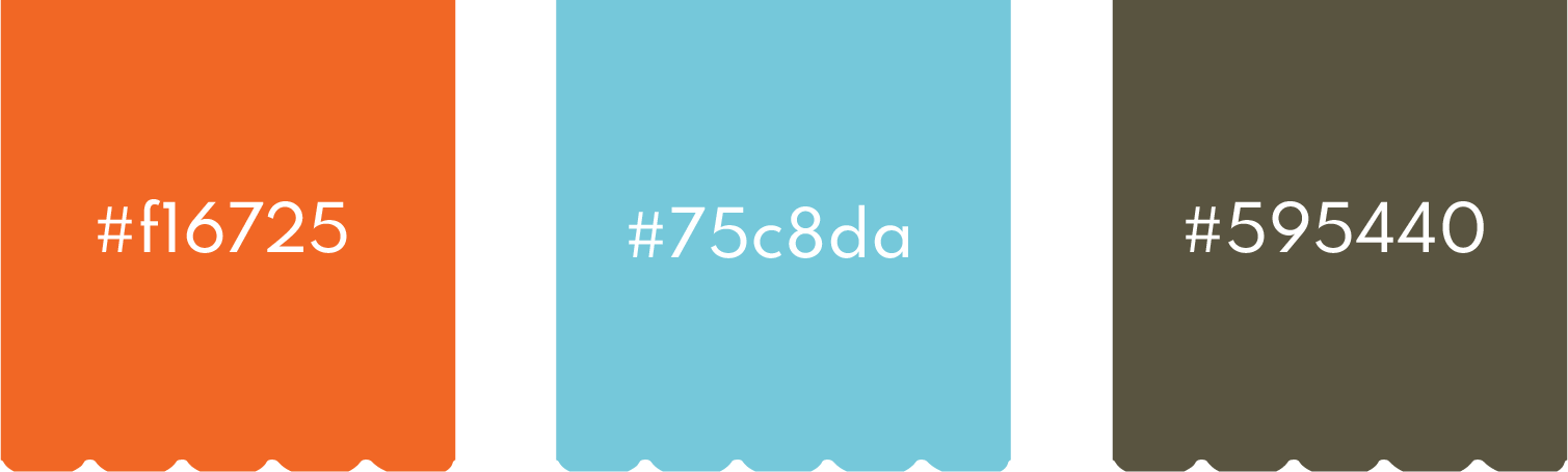
I used contemporary colours: blue in the centre to remind us of the sea salt, and orange to bring warmth and stimulation. I used a rectangular orange shape to help the logo to stand out, and some brown to help the rest of the design stand out.
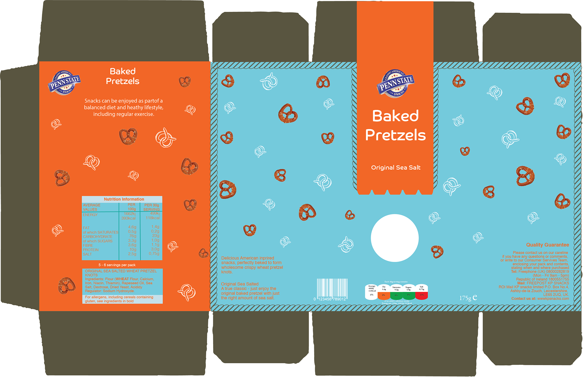
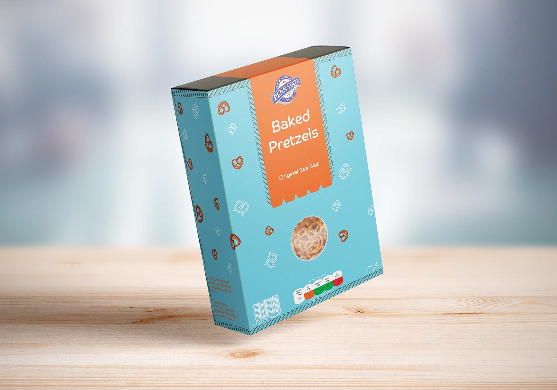
IMAGE STYLE
I used images of the pretzels to form a pattern, mixed with graphic vectors and photography. I incorporated a rope motif to emphasise the “knot” aspect of pretzels.